.png)
Can I adjust the number of columns for my social wall and grid layouts?
One of the most popular questions on our live chat is if you can increase or decrease the number of columns for a social wall and grid layout.
You can adjust the columns with a little bit of CSS. However, if you are not familiar with CSS and need help, don’t hesitate to get in touch with our customer success team.
Flockler’s social wall and grid layouts are responsive design and fit the area on your website automatically. Depending on the area width (or the device), the number of columns increases and decreases.
For example, if the area width is smaller than 600px, Flockler shows the wall and grid layouts in one column. On the other hand, when the area grows beyond 900px, Flockler shows three columns or more depending the area size.
Here is the list of area widths and screen sizes that you can edit for both the wall and grid layout:
Width larger than 2100px. Default is seven columns.
Width larger than 1800px. Default is six columns.
Width larger than 1500px. Default is five columns.
Width larger than 1200px. Default is four columns.
Width larger than 900px. Default is three columns.
Width larger than 600px. Default is two columns.
Width up to 600px. Default is one column.
Editing the Grid layout columns
If you’d like to edit the number of columns for any of the area widths/screen sizes listed above, you can do it with CSS. Here are the above default CSS values for the grid layout:
.flockler-grid-items[data-container-width='>=2100']
.flockler-grid-item {
  width: calc(1 / 7 * 100%);
}

.flockler-grid-items[data-container-width='>=1800']
.flockler-grid-item {
  width: calc(1 / 6 * 100%);
}

.flockler-grid-items[data-container-width='>=1500']
.flockler-grid-item {
  width: calc(1 / 5 * 100%);
}

.flockler-grid-items[data-container-width='>=1200']
.flockler-grid-item {
  width: calc(1 / 4 * 100%);
}

.flockler-grid-items[data-container-width='>=900']
.flockler-grid-item {
  width: calc(1 / 3 * 100%);
}

.flockler-grid-items[data-container-width='>=600']
.flockler-grid-item {
  width: calc(1 / 2 * 100%);
}

.flockler-grid-items[data-container-width='>=0']
.flockler-grid-item {
  max-width: 380px;
  width: calc(1 / 1 * 100%);
}
At first glance, the list might look a bit cryptic if you are not familiar with CSS. But all you need to worry about are two values per area size.
For example, if the area size is larger than 2100px (data-container-width='>=2100), Flockler shows 7 columns (width: calc(1 / 7 * 100%)).
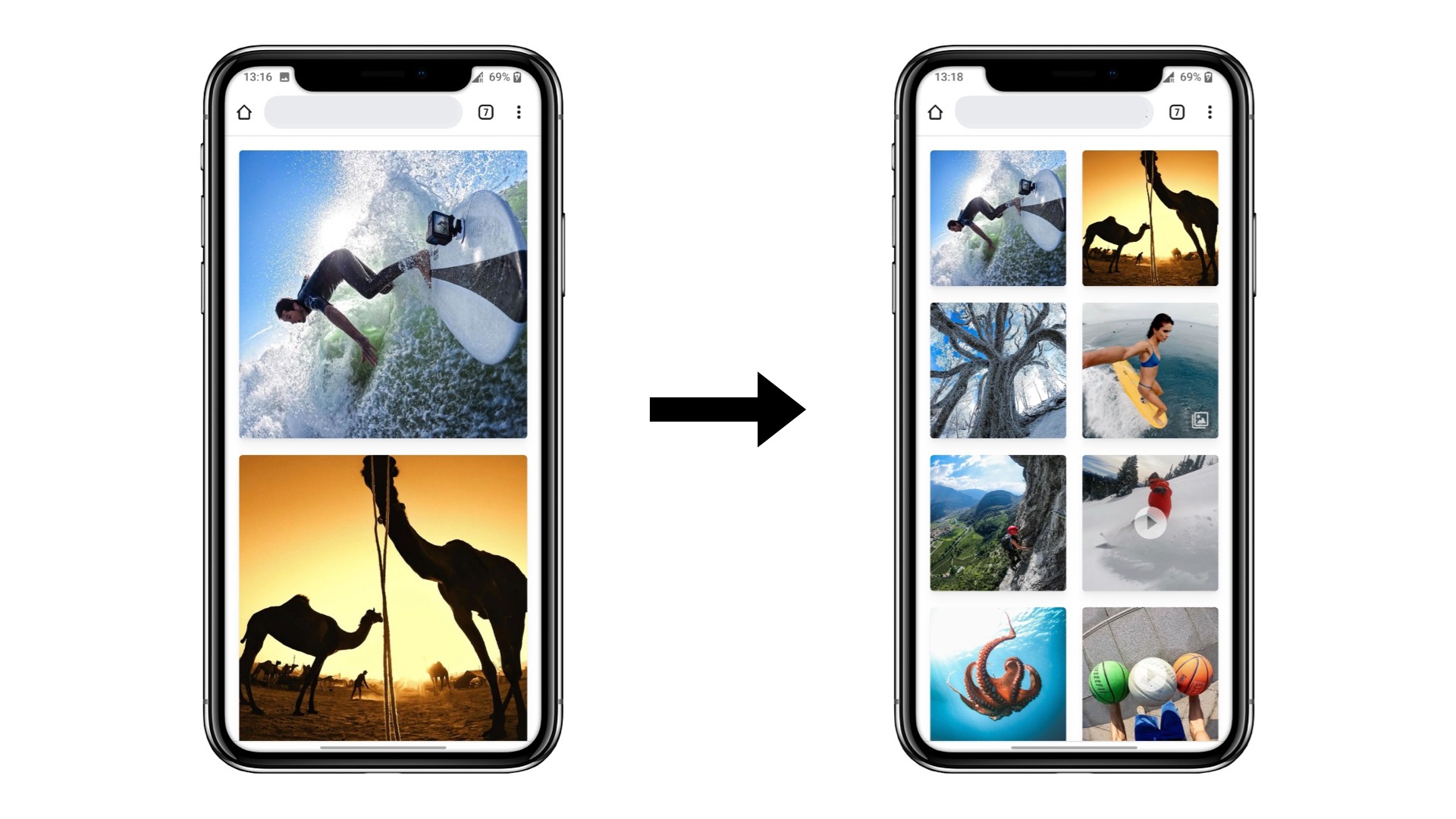
Now, let’s say you’d like to have two columns on a small mobile screen. You’d edit this value:
.flockler-grid-items[data-container-width='>=0']
.flockler-grid-item {
  max-width: 380px;
  width: calc(1 / 1 * 100%);
}
To show two columns on a mobile screen, simply change 1 / 1 to 1 / 2. Here’s how the value looks after editing:
.flockler-grid-items[data-container-width='>=0']
.flockler-grid-item {
  max-width: 380px;
  width: calc(1 / 2 * 100%);
}
Note that if you add more columns, some of the text or other elements might not fit. Always check the website and visible items after changes to the columns. If you’d like to adjust text sizes or need any other help, don’t hesitate to get in touch with our customer success team.
How to add the modified CSS to my display layout?
To apply this change to your display layout, follow these steps:
Log in and navigate to the Display tab.
Click 'Edit style and settings' for the grid you’d like to edit
Scroll at the bottom to the Advanced section and add the CSS to the field.

Save changes, and the grid shows two columns on a mobile screen less than 600px width.

For any screen size and area width, check the list of default values, edit the value indicating the number of columns, and add the edited CSS to the layout’s settings.
Editing the Wall layout columns
Follow the instructions for the grid layout above, and here’s the CSS for the Wall layout columns with default values:
.flockler-wall_v2-items[data-container-width='>=2100']
.flockler-wall_v2-item {
  width: calc(1 / 7 * 100%);
}

.flockler-wall_v2-items[data-container-width='>=1800']
.flockler-wall_v2-item {
  width: calc(1 / 6 * 100%);
}

.flockler-wall_v2-items[data-container-width='>=1500']
.flockler-wall_v2-item {
  width: calc(1 / 5 * 100%);
}

.flockler-wall_v2-items[data-container-width='>=1200']
.flockler-wall_v2-item {
  width: calc(1 / 4 * 100%);
}

.flockler-wall_v2-items[data-container-width='>=900']
.flockler-wall_v2-item {
  width: calc(1 / 3 * 100%);
}

.flockler-wall_v2-items[data-container-width='>=600']
.flockler-wall_v2-item {
  width: calc(1 / 2 * 100%);
}

.flockler-wall_v2-items[data-container-width='>=0']
.flockler-wall_v2-item {
  max-width: 380px;
  width: calc(1 / 1 * 100%);
}
If you have any questions or need help, don’t hesitate to send us a message.